Designers seeking a clean, consistent layout can unlock powerful visual harmony by adopting a 10x10 grid framework. This simple structure offers predictable rhythm, scalable spacing, and a clear path to balance, making it a go-to solution for both print and digital projects.
Why Adopt a 10x10 Grid?
The 10x10 grid—ten equally spaced columns and rows—provides a versatile skeleton that adapts to diverse content types. Unlike more complex 12‑column systems, the 10x10 grid offers a middle ground: it delivers enough flexibility for creative arrangements while maintaining a manageable number of units for quick decision making.
- Consistency – Every element aligns to a common scale, reducing visual clutter.
- Scalability – The same grid works on a mobile phone screen and a large billboard.
- Speed – Designers can calculate margins and gutters in whole numbers, speeding up layout drafts.
How to Set Up the Grid?
Start by defining the total width of your workspace, then divide it by ten to set the column width. Apply the same logic vertically for rows. Remember to add gutter space between columns and rows to prevent elements from touching.
- Choose a baseline height—common choices are 8 px, 10 px, or 12 px.
- Multiply the baseline by the number of rows to get total height.
- Use a content width that allows for a 20% left/right margin, then slice the remaining width into ten columns.
- Record these measurements in a style guide so all team members stay aligned.
What Are the Key Alignment Strategies?
Alignment anchors the grid’s power. Two main axes—horizontal and vertical—drive placement.
- Baseline grid – Keep text blocks on the baseline to avoid uneven lines.
- Column alignment – Position headings or images on whole columns to create a tidy visual flow.
- Nested grids – For complex sections, embed a smaller grid (e.g., 4x4) within a column to maintain order.
How Should Spacing Be Managed?
Spreading space thoughtfully differentiates hierarchy. Use the grid’s units as a multiplier:
- 1–3 units for tight, focused content.
- 4–6 units for generous breathing room.
- 7–10 units to emphasize a focal point or break sections.
Applying consistent padding between elements prevents a cramped look and guides the eye smoothly across the layout.
What Are Responsive Challenges and How to Overcome Them?
When scaling from desktop to mobile, the grid must collapse gracefully. A common solution is to stack columns while preserving the baseline. Techniques include:
- Use CSS Grid’s
repeat(auto-fit, minmax(…))to auto‑adjust column count. - Apply media queries to modify gutter width and column count at breakpoints.
- Maintain a flexible baseline that scales with font size changes.
What Mistakes Can Break the Grid?
Even seasoned designers slip into habits that undermine a 10x10 grid. Watch for:
- Over‑stretching content – Filling a full ten columns with a single paragraph can feel unbalanced.
- Using irregular gutter sizes that break rhythm.
- Ignoring the baseline for text, resulting in uneven line boxes.
- Over‑emphasis on decorative elements that override grid alignment.
Regularly review each layout against the grid’s guidelines to ensure every element earns its place.
How Does the Grid Translate to Real Projects?
Consider a news website redesign. By assigning headlines to three columns, sub‑headings to two, and image thumbnails to one, designers create a visual hierarchy that guides readers naturally. On a mobile view, the same logic applies but with stacked columns, keeping navigation intuitive.
For print, a magazine spreads its editorial spreads across a 10x10 grid, ensuring that advertising inserts and editorial photos maintain consistent margins, giving the publication a polished, cohesive feel.
Where to Find More Resources?
Design blogs, UI libraries, and design system repositories frequently include 10x10 grid templates. Incorporating these templates into your workflow can jumpstart consistency across teams.
Transform Plate Boundary
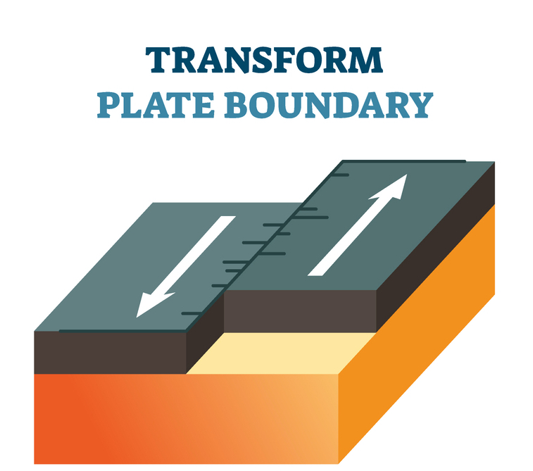
Transform Plate Boundary
Plate Tectonics - Licchavi Lyceum

Plate Tectonics - Licchavi Lyceum
Plate Boundaries Convergent Divergent Transform
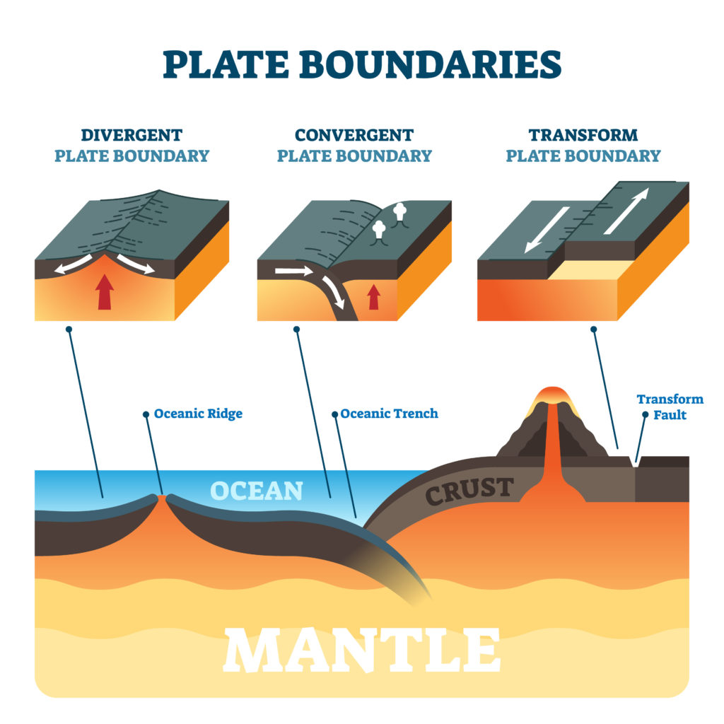
Plate Boundaries Convergent Divergent Transform
3.0 Plate Boundaries (overview) - DGGV
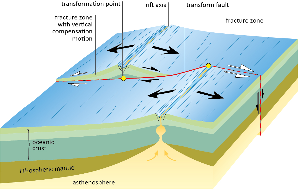
3.0 Plate Boundaries (overview) - DGGV
Transform Fault Fence Transform Plate Boundaries Geology (U.S.

Transform Fault Fence Transform Plate Boundaries Geology (U.S.