Printable names—those bold, memorable titles that appear on flyers, business cards, and digital branding—must balance readability, aesthetic appeal, and scalability. When designers skip basic principles, a name can look unprofessional or become illegible at small sizes. Below are the most common pitfalls to sidestep, along with trade‑offs and realistic expectations for each.
Why is font choice a critical decision?
Choosing a typeface that looks good in print but also scales to digital sizes is a frequent source of error. Designers often default to trendy sans‑serifs because they’re easy to read. However, too much simplicity can make a brand feel generic.
- Pros of a custom typeface: Unique identity and higher perceived value.
- Trade‑offs: Requires licensing or design time; may not render well on low‑resolution printers.
- Realistic expectation: Stick to one or two complementary fonts; avoid mixing too many styles.
Can you rely on automatic kerning to solve spacing issues?
Automatic kerning is convenient, but it can produce awkward gaps, especially with unusual character combinations. Manual adjustments are often needed for names that contain non‑standard letters or ligatures.
- Pros of manual kerning: Precise control over letter spacing, improved legibility.
- Trade‑offs: Time‑consuming; may require a professional typographer for optimal results.
- Realistic expectation: Use automated tools as a baseline, then refine manually in the final proof.
What happens when you ignore the printing medium?
A name that looks great on a screen may fail on a glossy brochure or a matte business card. Paper weight, finish, and ink type influence contrast and color fidelity.
- Pros of testing on multiple media: Ensures consistency across platforms.
- Trade‑offs: Additional cost for proofs; longer turnaround.
- Realistic expectation: Create a small set of proofs (digital PDF, printed A5, and business‑card mockups) before finalizing.
Should you overuse decorative elements to make a name stand out?
Excessive flourishes—like shadows, gradients, or elaborate borders—can clutter the design and reduce readability, especially when scaled down for social media icons.
- Pros of subtle embellishment: Adds personality without compromising clarity.
- Trade‑offs: Over‑decorating can make a brand appear dated quickly.
- Realistic expectation: Use one or two understated accents (e.g., a subtle underline or a minimalist icon) and test legibility at 30% size.
Are color choices always a matter of brand identity?
Color selection goes beyond logo palettes. Certain hues print differently on various paper types, and some colors bleed into adjacent spaces if not carefully chosen.
- Pros of color testing: Avoids costly re‑prints and preserves brand consistency.
- Trade‑offs: Requires a calibrated monitor and a color‑matching system.
- Realistic expectation: Choose no more than two complementary colors for the name; test on the intended paper stock before final approval.
How do you handle trademark or legal constraints in printable names?
Even a well‑designed name can be invalidated if it infringes on existing trademarks. A quick search on USPTO or the relevant authority’s database is essential before finalizing.
- Pros of early trademark checks: Saves time and legal costs.
- Trade‑offs: May delay design timelines if the name is already in use.
- Realistic expectation: Allocate a day for legal vetting in the project schedule.
What are the final steps before mass production?
Before sending the design to print, compile a comprehensive style guide that details font files, color profiles, and spacing rules. This document should be shared with printers, web developers, and marketing teams to maintain consistency.
By systematically avoiding these design pitfalls, researchers and designers alike can create printable names that not only look professional but also perform reliably across all media. The key is to balance creative flair with practical constraints—testing, refining, and documenting every step to ensure the final product meets both aesthetic and functional standards.
Avoid In English: Usage, Structure & Examples
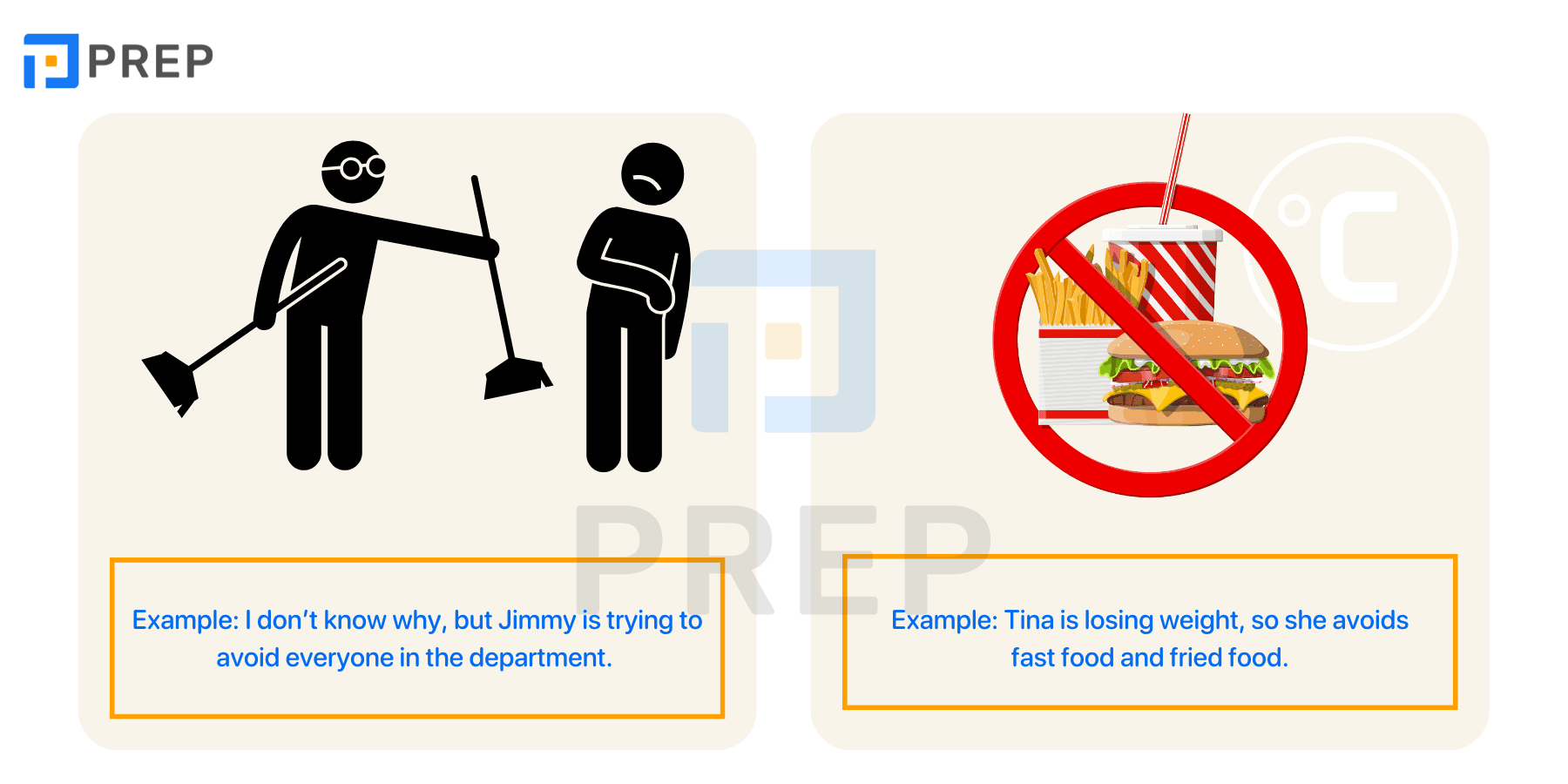
Avoid in English: Usage, Structure & Examples
Foods To Eat And Avoid During Pregnancy: New Mum's Guide 2024 – WJL

Foods to Eat and Avoid During Pregnancy: New Mum's Guide 2024 – WJL
Avoid Sign
Avoid Sign
Avoid Touching Eye Nose And Mouth - Illustration As EPS 10 File Stock
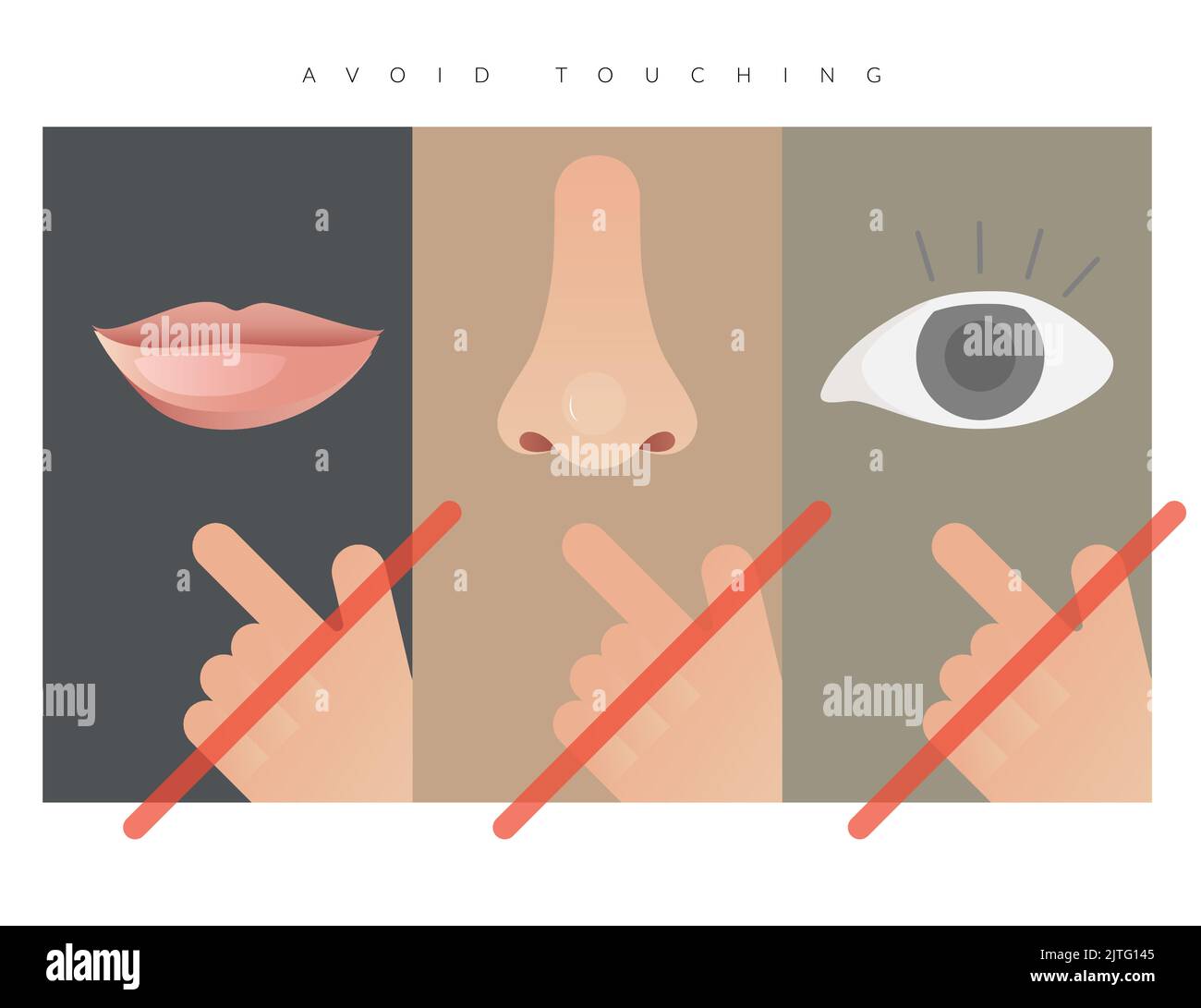
Avoid Touching Eye Nose and Mouth - Illustration as EPS 10 File Stock ...
Avoid — перевод, транскрипция, произношение и примеры
Avoid — перевод, транскрипция, произношение и примеры