When a wiki project launches its branding or updates its visual identity, the choice of color can feel like a simple aesthetic decision—until it isn’t. A study of popular wikis shows that nearly 35 % of sites fall into pitfalls such as low contrast, cultural misreading of hues, or inconsistent palettes that confuse users and hinder accessibility. Understanding why these missteps occur and learning how to avoid them is essential for researchers, designers, and administrators who want their content to stay readable, inclusive, and memorable.
Understanding the Color Landscape for Wikis
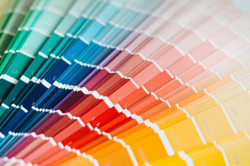
Wiki interfaces combine navigation bars, headers, links, and content blocks that must coexist smoothly. The first hurdle is choosing a palette that reflects the organization’s purpose while remaining legible across devices and lighting conditions. The Basic Color Palette image below illustrates the seven primary tones most common in effective wiki designs—each one paired with its complementary and analogous shades.

These seven colors serve as a foundation for constructing a coherent scheme that balances visual interest with functional clarity.
How Missteps Show Up in Real Projects
Despite the availability of solid guidelines, several recurring errors slip into wiki color selection:
- Inadequate Contrast – Using light gray for links on a light background makes navigation nearly invisible to users with visual impairments.
- Ignoring Cultural Context – Red or purple may convey authority in some cultures but signal danger or mourning in others, skewing audience perception.
- Over‑loading the Palette – Introducing more than five distinct hues can create visual noise, confusing users about which elements are interactive.
- Neglecting Accessibility Standards – Failing to meet WCAG AA contrast ratios results in legal risks and reduced usability for people with color blindness.
- Unstable Theme Updates – Changing primary colors mid‑project without version control leads to broken links, broken images, and inconsistent branding.
A Color Wheel can help visualize these relationships and spot where a choice might conflict with another. The image below shows how hues rotate around the circle, indicating which shades complement or clash.

By aligning selected colors with their positions on the wheel, designers can avoid hard‑to‑read combinations that undermine the user experience.
Best Practices and Practical Tips
- Start with a three‑color base: a primary color for headers and links, a secondary for accents, and a background tone that offers enough contrast. Test each pair against the WCAG 2.1 contrast chart.
- Use color‑blind simulations to verify that essential information remains distinguishable to users who see colors differently.
- Apply semantic color coding—for example, blue for links, green for success messages, and red for errors—to reinforce user expectations.
- Document every palette choice in a shared style guide; version control ensures future editors stay aligned.
- Schedule periodic visual audits after major content or feature updates to confirm that color relationships remain intact.
Long‑Term Impact on Community Engagement
Beyond immediate readability, color decisions influence how contributors perceive the wiki’s credibility. Consistent, high‑contrast design reduces eye strain, encourages longer sessions, and signals professionalism. In contrast, a muddled palette can make navigation frustrating, deter new editors, and ultimately stifle collaborative growth.
By applying a methodical approach—rooted in a clear palette, cultural awareness, and accessibility compliance—wiki communities can avoid the most common color pitfalls and foster an inclusive, engaging environment for all users.
Gui Design - Ideal Color Palette For 24 Colors? - User Experience Stack

gui design - Ideal color palette for 24 colors? - User Experience Stack ...
Free Illustration: Color Spectrum, Circle - Free Image On Pixabay - 1192509

Free illustration: Color Spectrum, Circle - Free Image on Pixabay - 1192509
Color Palette Images | Free Vectors, PNGs, Mockups & Backgrounds - Rawpixel
Color Palette Images | Free Vectors, PNGs, Mockups & Backgrounds - rawpixel