Residency applicants and program directors alike rely on NRMP Charting Outcomes to gauge competitiveness, set expectations, and shape interview strategies. Yet many interpret the data without a systematic approach, leading to skewed decisions. This article pinpoints the most frequent misreadings and offers actionable alternatives that busy professionals can implement immediately.
Why the Raw Numbers Can Mislead
Do I need to trust the average match rank alone?
Most readers focus on the mean rank at which applicants matched, assuming it predicts where they will land. The average, however, masks a wide distribution: a handful of outliers can pull the mean upward while the median remains much lower. Relying solely on the mean can cause applicants to aim for an unattainably high number of programs.
Is a specialty’s “match rate” the whole story?
Match rate percentages often appear as a health check for a field, but they omit critical context such as the proportion of positions filled by US graduates versus international medical graduates, or the impact of supplemental offers. Ignoring these nuances can distort a program’s perceived desirability.
Smarter Ways to Interpret the Data
What questions should I ask before drawing conclusions?
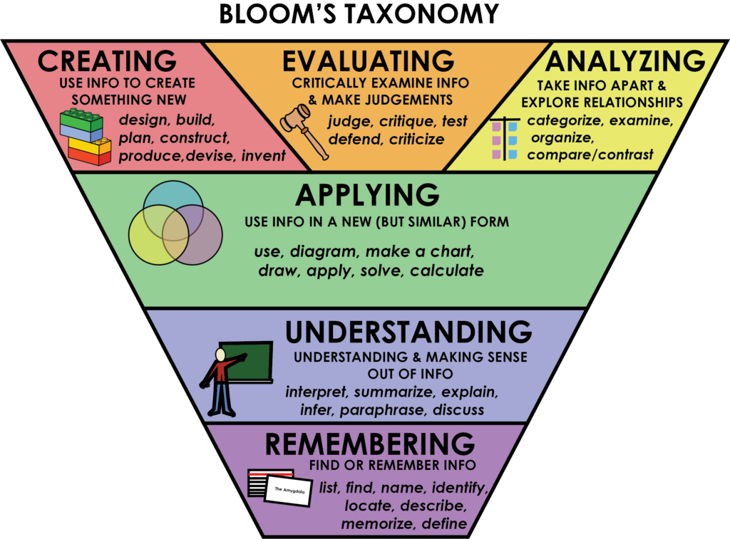
Adopting a Bloom’s‑taxonomy style checklist forces a deeper dive. Start with “Remember” – list the exact metrics reported. Move to “Understand” – clarify definitions (e.g., “first‑choice match” vs. “any match”). “Apply” by mapping metrics to your own application timeline, then “Analyze” the variance across regions or program sizes. Finally, “Evaluate” the relevance of each data point to your personal goals before “Creating” a customized rank list.
How can I use percentile rankings instead of averages?
Percentiles reveal where an applicant falls relative to peers. For instance, knowing you are in the 70th percentile for US MD applicants in dermatology provides a clearer benchmark than a raw average rank of 12. Percentile data also highlights the “sweet spot” where most successful candidates rank programs, helping you avoid over‑ or under‑applying.
Should I factor in program‑specific trends?
National aggregates are useful, but program‑level data—such as average USMLE scores of matched residents, the proportion of alumni who pursue fellowships, or recent changes in curriculum—offer sharper predictive power. When the NRMP releases program‑specific supplemental data, cross‑reference it with the broader chart to identify outliers that may suit your profile.
Practical Steps for Busy Applicants and Directors
- Build a quick reference table. List each specialty’s median match rank, 25th/75th percentiles, and match rate broken down by applicant type.
- Set a “decision buffer.” Add two to three ranks above the median to accommodate unexpected shifts in applicant behavior.
- Run a “what‑if” scenario. Use a spreadsheet to simulate how changing one variable—like stepping up your USMLE score—shifts your percentile and likely match rank.
- Schedule a data review. Allocate 30 minutes weekly during the application season to compare your evolving profile against the latest NRMP release.
Implications for Program Directors
How can directors avoid over‑interpreting national trends?
Programs often adjust interview caps based on national match rates, assuming a direct correlation with applicant pool quality. By analyzing their own historical match outcomes—such as the average rank of residents who stayed for fellowship—you can tailor interview numbers more precisely, preserving resources without sacrificing match success.
What metrics best predict resident performance?
Beyond USMLE scores, recent NRMP data shows a modest link between research productivity and fellowship placement. Directors should weigh a composite score that includes scholarly output, clinical evaluations, and leadership experiences rather than leaning heavily on any single figure.
Understanding NRMP Charting Outcomes Data Analysis is less about memorizing numbers and more about asking the right questions, contextualizing metrics, and translating insights into concrete actions. By sidestepping common shortcuts and adopting a structured analytical routine, both applicants and programs can make smarter, evidence‑based decisions that align with real‑world goals.
What's So Funny About Peace And Love & Understanding? - Get Real Post
What's So Funny About Peace and Love & Understanding? - Get Real Post
Ideas — The Learner's Way

Ideas — The Learner's Way
Consensus Building In The Paranormalist Community – Etheric Studies
Consensus Building in the Paranormalist Community – Etheric Studies
Understanding - Free Of Charge Creative Commons Tablet Dictionary Image

Understanding - Free of Charge Creative Commons Tablet Dictionary image