When you pair a blue hue with its true opposite, you instantly create visual tension that can highlight key messages, boost brand recall, and drive conversions—all without expensive redesigns. This guide breaks down which colors sit opposite blue on the spectrum, how to use them for maximum impact, and where the pitfalls lie for budget‑conscious creators.
Why Complementary Colors Matter for Blue
Blue dominates many corporate identities because it conveys trust and stability. Its complementary color—found directly across the color wheel—offers a natural contrast that catches the eye without clashing. Leveraging this relationship lets you guide viewers’ attention, differentiate calls‑to‑action, and reinforce hierarchy without adding extra visual elements.
Selecting the Right Opposite for Your Shade
Not all blues are created equal. A deep navy leans toward a richer, reddish‑orange, while a bright cyan pairs best with a soft, warm pink‑orange. Identify your base hue first, then match it with the complementary tone that shares similar saturation but opposite value.
- Classic navy → burnt orange: Ideal for finance or legal sites that need a pop of warmth.
- Sky blue → coral: Works well for lifestyle brands targeting youthful audiences.
- Teal → rust red: Adds depth to eco‑focused products without feeling gimmicky.
Practical Applications That Boost ROI
Integrating the opposite color strategically can improve click‑through rates, reduce bounce, and increase perceived value. Consider these low‑cost tactics:
- Button accents: Use the complementary hue for primary CTA buttons while keeping surrounding text in blue for readability.
- Header backgrounds: A subtle orange gradient behind a blue headline creates a focal point that draws the eye without overwhelming the page.
- Infographic highlights: Swap a portion of blue data bars for the opposite shade to emphasize key metrics.
Cautions: When the Contrast Becomes a Distraction
Even the most harmonious pairing can backfire if overused. Excessive orange next to blue can feel aggressive, especially in cultures where orange signals warning. Keep the opposite color to under 30 % of the overall palette and test legibility across devices. Also, be wary of saturation mismatches; a neon orange next to a muted blue will look garish rather than sophisticated.
Quick Reference: Opposite Colors for Common Blues
| Blue Shade | Opposite Hue | Best Use Cases |
|---|---|---|
| Midnight navy (#001F3F) | Burnt orange (#FF6600) | Financial dashboards, corporate reports |
| Sky blue (#87CEEB) | Coral (#FF7F50) | Travel blogs, youth apparel |
| Teal (#008080) | Rust red (#B7410E) | Sustainable products, craft marketplaces |
| Royal blue (#4169E1) | Golden amber (#FFBF00) | Luxury services, premium subscriptions |
Next Steps for Value‑Focused Designers
Start by auditing your current blue assets. Identify the dominant hue, then apply the complementary shade to a single element—preferably a CTA or highlight box. Track performance metrics for at least two weeks; a modest 5‑10 % lift in engagement often justifies the effort. If results stall, revisit saturation levels or reduce the opposite color’s footprint.
Cash ISAs Twice As Popular As Stocks And Shares ISAs — TN Accountancy

Cash ISAs twice as popular as stocks and shares ISAs — TN Accountancy ...
Stocks And Shares Account At Eliza Pethebridge Blog

Stocks And Shares Account at Eliza Pethebridge blog
Cash ISA Vs Stocks & Shares ISA: Everything You Need To Know - IG UK
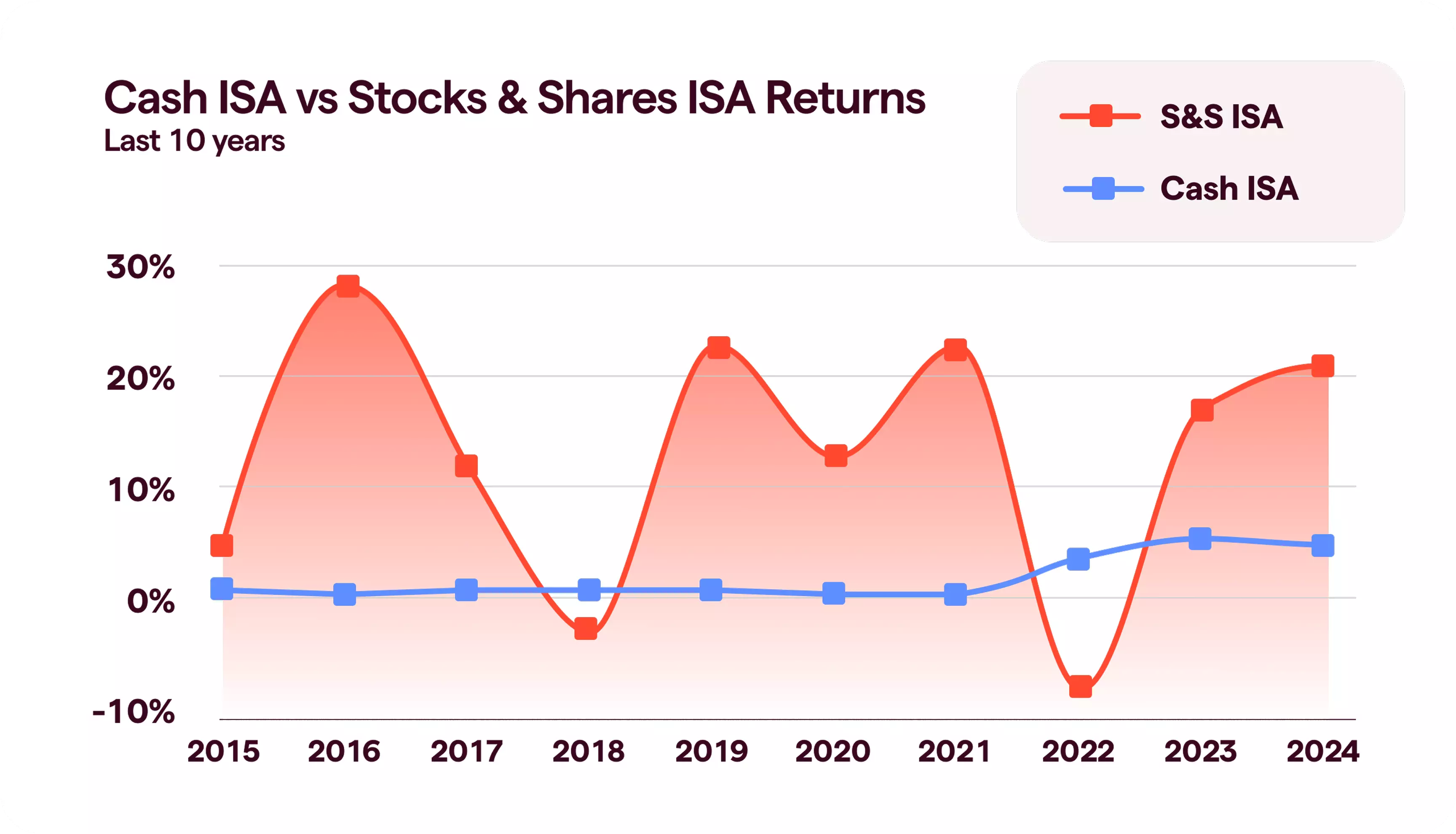
Cash ISA vs Stocks & Shares ISA: Everything you Need to Know - IG UK
Average Investment Isa Returns At Evan North Blog

Average Investment Isa Returns at Evan North blog
What Is An ISA? ISAs Explained - Nuts About Money®
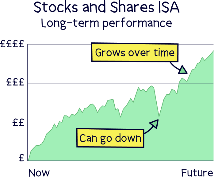
What is an ISA? ISAs explained - Nuts About Money®