Designers, educators, and hobbyists alike rely on the 10‑by‑10 grid to organize visual information, plan lesson layouts, or sketch game boards. Yet a surprising number of newcomers stumble over the same pitfalls—overcrowding, uneven spacing, and ignored hierarchy—leading to confusing results that defeat the grid’s purpose. Below, we unpack the most frequent errors and present practical alternatives that keep the layout clean, functional, and easy to read.
What exactly is a 10‑by‑10 grid and when should I reach for it?
A 10‑by‑10 grid is a simple matrix of 100 equal squares, typically used as a starter canvas for pixel art, data tables, or classroom seating charts. Its appeal lies in the balance between granularity and manageability: each cell is large enough to hold a symbol or short text, while the whole structure remains quick to draw on paper or in software. Beginners choose it because it offers a clear visual scaffold without the complexity of custom column widths or responsive breakpoints.
Which mistakes sabotage a 10‑by‑10 grid the most?
- Overcrowding cells. Packing too many icons or words into a single square forces the eye to work harder, reducing readability.
- Uneven spacing. Ignoring the uniform distance between rows or columns creates visual bias, making some sections appear more important than others.
- Neglecting hierarchy. Treating every cell as equal can hide the logical flow of information, especially in instructional layouts.
- Inconsistent alignment. Mixing left‑aligned text with centered graphics within the same column breaks the grid’s rhythm.
- Forgetting scale. Using the same grid for both detailed pixel art and large‑format diagrams stretches the design beyond its optimal resolution.
How can I correct these errors before they derail my project?
Should I limit the amount of content per cell?
Yes. Aim for a maximum of one icon or a brief label (no more than three words) per square. If a concept needs more space, merge adjacent cells or switch to a larger grid.
What’s the best way to maintain even spacing?
Use ruler tools in your graphics program or draw faint guide lines on paper before filling in content. A quick check: measure the distance between the left edges of two adjacent cells; they should match the distance between the top edges of two rows.
How do I establish hierarchy without breaking the grid?
Apply visual weight selectively—bold fonts, larger icons, or a contrasting background color—to the cells that represent primary steps or key data. Keep the rest in a neutral style to preserve the grid’s overall cohesion.
What habits or tools help keep the grid tidy over time?
Adopt a “grid‑first” checklist before you start: verify cell count, confirm uniform spacing, and decide which cells will carry emphasis. Digital designers benefit from templates in programs like Adobe Illustrator or Figma, where the 10‑by‑10 matrix can be locked as a background layer. Paper‑based creators might print a reusable grid sheet and use a lightbox to trace consistent lines.
By recognizing these common missteps and applying the corrective steps outlined above, beginners can transform a basic 10‑by‑10 grid from a stumbling block into a reliable framework for clear, organized design.
Assessment Strategies Stock Vector Images - Alamy

Assessment strategies Stock Vector Images - Alamy
Avoid Bad Habits Banner With Man Shop Stop Gesture

Avoid bad habits banner with man shop stop gesture
Avoid Contact Icon Vector Flat 26606955 Vector Art At Vecteezy

Avoid contact icon vector flat 26606955 Vector Art at Vecteezy
Avoid Verb Forms – Past Tense Of Avoid Past Participle & V1 V2 V3 V4
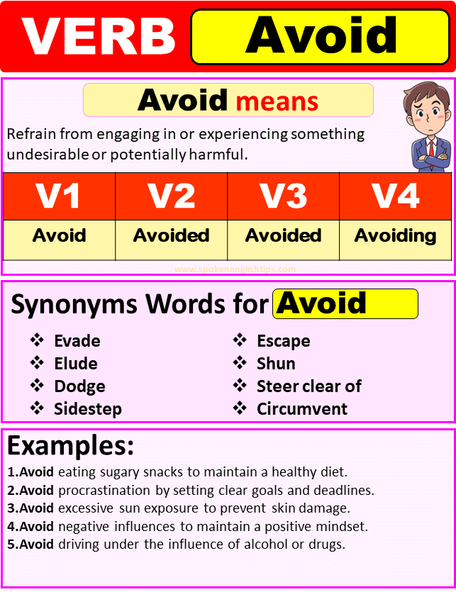
Avoid Verb Forms – Past Tense Of Avoid Past Participle & V1 V2 V3 V4