Small businesses and community groups across the United States are discovering that a well‑crafted logo is more than a pretty picture; it’s the first line of defense against brand confusion, costly redesigns, and missed connections. Recent surveys of local entrepreneurs reveal two recurring themes: the struggle to create a logo that endures market shifts, and a handful of avoidable slip‑ups that sap credibility before the brand even launches.
Why Some Logos Outlast the Rest
Enduring logos share three practical traits: visual simplicity, contextual flexibility, and a clear story tied to the brand’s core promise. For a coffee shop in Portland, a single stylized bean paired with a hand‑drawn typeface tells a story of craft without overwhelming the eye. In contrast, a tech startup that piles on gradients, 3‑D effects, and industry jargon often looks dated within a year.
These traits are not abstract ideals; they translate into measurable benefits. Simpler marks reproduce cleanly on everything from a 2‑inch business card to a 30‑foot billboard, reducing print errors and keeping brand costs low. Flexible marks—those that work in monochrome, reversed, or stacked—avoid the “one‑size‑fits‑none” trap that forces businesses to commission multiple versions later.
Common Mistakes That Undermine Longevity
Even seasoned designers fall into familiar traps, and everyday users are especially prone to three missteps:
- Copying trends instead of values. Borrowing the latest flat‑design icon set may look modern now, but it erodes uniqueness once the trend fades.
- Neglecting scalability. A logo that relies on fine details or tiny text becomes illegible on a mobile app icon, prompting costly redesigns.
- Skipping a style guide. Without clear usage rules, employees may stretch colors or alter spacing, diluting the brand’s visual integrity.
AI‑Powered Design: A Double‑Edged Sword
Tools like Midjourney have democratized logo creation, allowing a bakery owner in Austin to generate dozens of concepts in minutes. While speed is a win, the ease of production masks two hidden hazards: over‑reliance on algorithmic aesthetics and inadvertent copyright exposure.
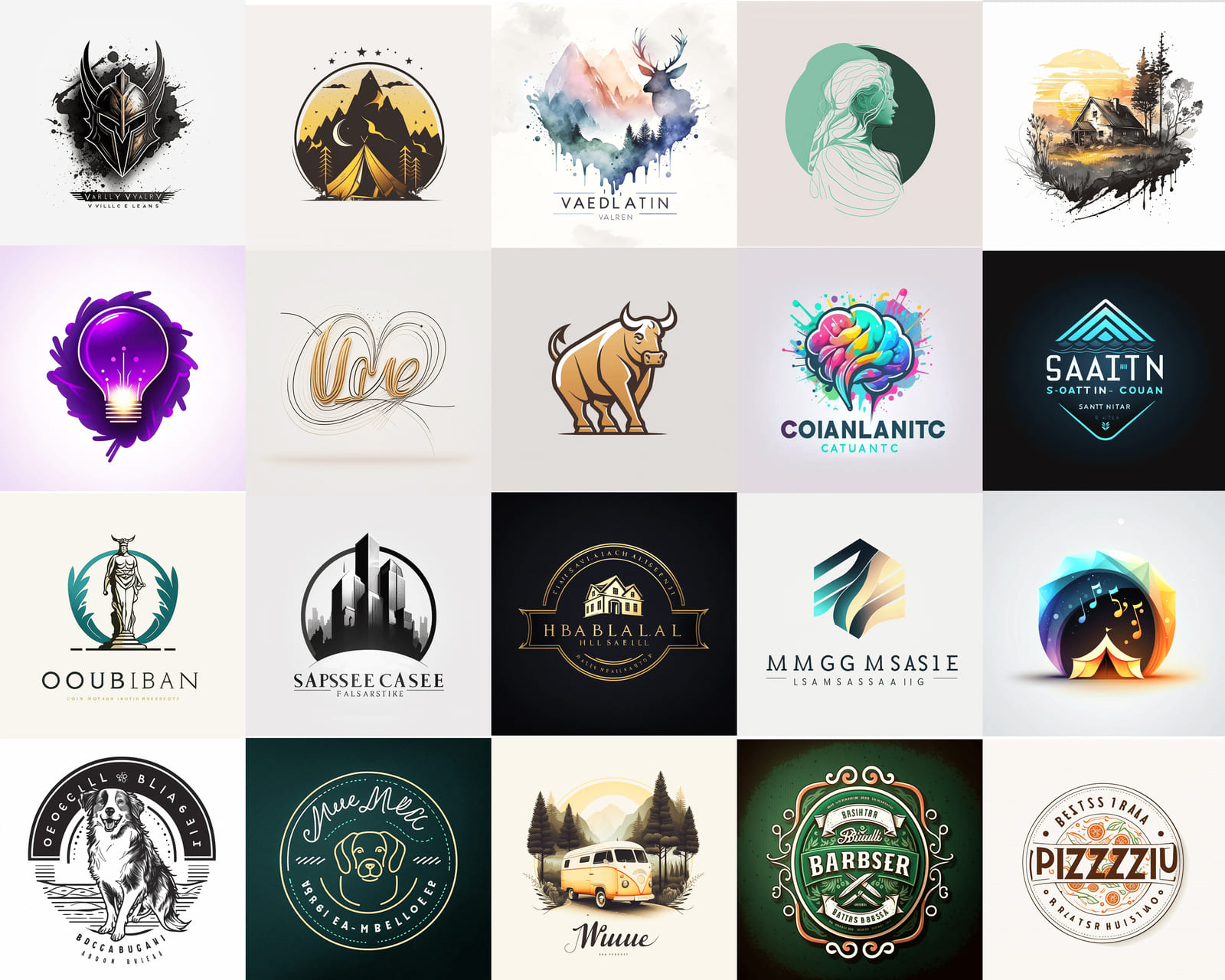
When an AI suggests a design that mirrors an existing trademark, the legal fallout can be swift and expensive. Moreover, AI‑driven logos often feature excessive ornamentation—a byproduct of the model’s training data—leading back to the scalability issue mentioned above. The prudent approach is to treat AI output as a sketchbook, not a finished product.
Balancing Creativity with Real‑World Constraints
For a local nonprofit, the ideal logo must convey mission, inspire volunteers, and fit a limited budget. The decision matrix looks like this:
- Concept relevance. Does the symbol speak to the organization’s purpose?
- Production cost. Can the design be reproduced in black‑and‑white ink without loss?
- Future adaptability. Will the mark still make sense if the program expands?
Comparing a handcrafted monogram against a complex AI‑generated emblem often reveals that the simpler option wins on all three fronts, even if it feels less “cutting‑edge.”
Practical Checklist for Avoiding Logo Pitfalls
Before hitting “save” on a final file, everyday users should run through this short audit:
- Test the logo at 1 inch, 3 inches, and full‑scale to confirm legibility.
- Print a grayscale version; if contrast disappears, adjust colors or line weight.
- Search a trademark database for similar marks; a quick online check can prevent costly legal battles.
- Draft a one‑page style guide covering primary/secondary colors, clear space, and prohibited alterations.
- Solicit feedback from three people outside the design team—preferably a mix of customers and suppliers.
What This Means for Local Brands
When a logo survives the first three years without a redesign, owners typically report lower marketing spend and higher brand recall among local shoppers. The takeaway for everyday users is clear: invest time in the fundamentals, resist the lure of fleeting trends, and treat AI tools as collaborators, not replacements. By doing so, a small logo can become a lasting emblem that carries a community’s identity forward.
Photos White Logo At Mary Nugent Blog
Photos White Logo at Mary Nugent blog
Logo PNG Pour Téléchargement Gratuit

Logo PNG pour téléchargement gratuit
World Biggest Brands Logo Design History Amazing Story
World Biggest Brands Logo Design History Amazing Story