When a data scientist turns raw numbers into a compelling story, the first brushstroke is often a choice of color. In Matplotlib, selecting the right palette can make the difference between a chart that dazzles and one that confuses. This guide translates the theory of color perception and design into actionable steps for everyday users who need to produce clear, accessible visualizations.
Why Does Color Matter in Data Visualizations?
Color is more than decoration; it encodes information, highlights trends, and guides the eye. A well‑chosen palette reduces cognitive load, allows rapid comparison, and keeps viewers focused on the data's narrative. In contrast, arbitrary hues can mislead or distract, especially when the audience includes people with color‑vision deficiencies.
How to Pick a Palette That Tells a Story
Begin by identifying the visual hierarchy of your plot. Is it categorical, sequential, or diverging? Matplotlib’s built‑in colormaps—such as “viridis”, “plasma”, and “inferno”—serve sequential data well, while “coolwarm” or “bwr” handle diverging data. When dealing with geographic maps, consider the natural context: deserts, forests, or urban heat islands each benefit from specific tones.
For a practical illustration, let’s plot a heat map of the Sahara and Sahel. Using a diverging colormap with warm reds for arid zones and cool blues for more vegetated regions communicates the gradient at a glance. Below is a satellite image of the region that demonstrates how color enhances spatial understanding.
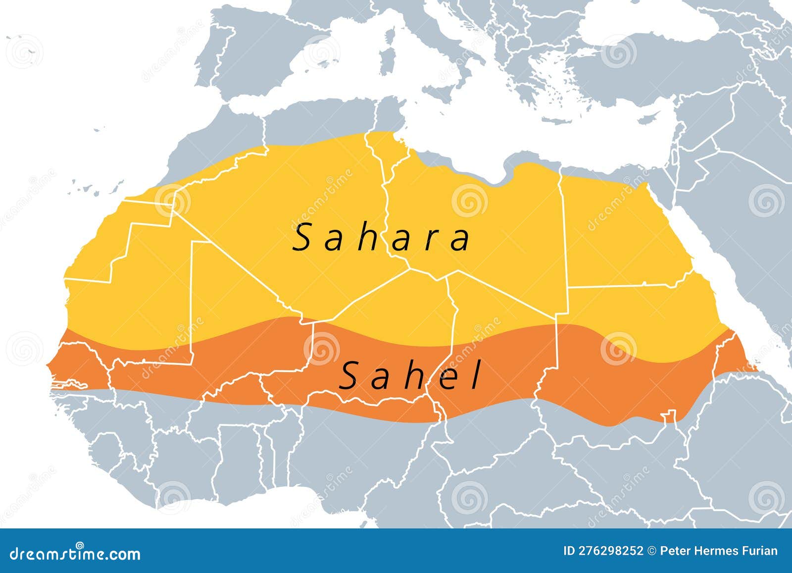
To replicate this effect, load the image into a Basemap or Cartopy projection, overlay a data layer (e.g., rainfall or temperature), and apply a suitable colormap. The color gradient not only looks striking but also conveys the underlying statistics.
Can You Ensure Accessibility with Color‑Blind Safe Palettes?
About 8% of men and 0.5% of women of Northern European descent have some form of color blindness. Matplotlib offers the “viridis”, “magma”, and “cividis” palettes that are designed to remain distinguishable under such conditions. Testing your plots with the colorblind module from cmaputil or using the online Coblis simulator provides an extra safety net.
- Step 1: Choose a color‑blind friendly palette.
- Step 2: Verify contrast ratios exceed WCAG 2.0 AA standards.
- Step 3: Add pattern fills for critical distinctions if needed.
What Tools Does Matplotlib Offer to Simplify Palette Selection?
Matplotlib’s pyplot.set_cmap() allows quick switching between built‑in maps. The cycler module can cycle through custom color lists, while the colormaps module gives direct access to a large collection. For deeper control, integrate Seaborn’s palette functions or the cmocean package for oceanographic themes.
import matplotlib.pyplot as pltplt.colormaps()– list available palettes.plt.cm.get_cmap('viridis')– fetch a specific colormap.
How to Blend Custom Palettes into Existing Projects?
Suppose you have brand colors that must appear in your report. Create a custom list:
brand_colors = ['#003f5c', '#2f4b7c', '#665191', '#a05195', '#d45087']
plt.rcParams['axes.prop_cycle'] = cycler('color', brand_colors)
Apply this cycle to line charts, bar plots, and scatter plots, ensuring consistency across documents. When mixing brand colors with data‑driven palettes, use a dual‑colormap strategy: categorical data adopts brand hues, while continuous variables use a perceptually uniform gradient.
What Are the Implications for Real‑World Projects?
Adopting a thoughtful color strategy saves time in the long run. It reduces the need for re‑design, improves readability, and elevates the professionalism of deliverables. Teams that document their palette choices can maintain visual consistency across dashboards, publications, and presentations.
Moreover, an accessible color scheme expands your audience. When stakeholders include clinicians, policymakers, or the general public, color choices that accommodate all viewers strengthen trust and clarity.
Ready to Apply These Concepts?
Start by revisiting an existing chart. Identify the data type, test a built‑in colormap, and then iterate with a custom palette if necessary. Use the image of the Sahara desert as a template for geographic visualizations, and remember that color is a language—use it wisely to convey meaning without distortion.
6 Free Printable Sahara Desert Map With Countries PDF | World Map With
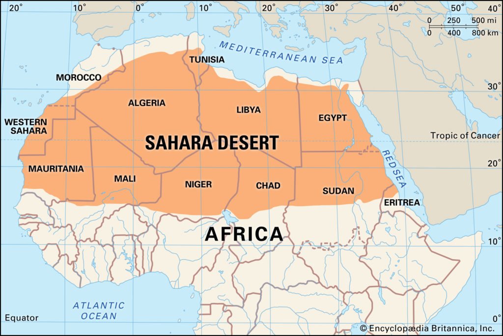
6 Free Printable Sahara Desert Map with Countries PDF | World Map With ...
Sahara Desert Map 741 Sahara Map Stock Photos, High Res Pictures, And

Sahara Desert Map 741 Sahara Map Stock Photos, High Res Pictures, And
Sahara Desert Map Images, Stock Photos & Vectors | Shutterstock
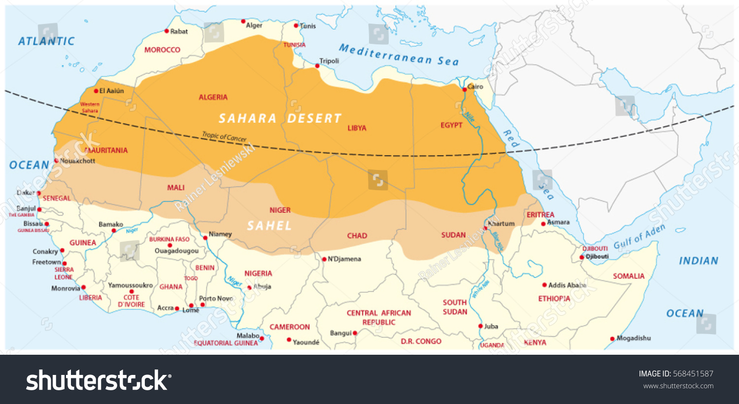
Sahara desert map Images, Stock Photos & Vectors | Shutterstock
947 African Savanna Map Royalty-Free Images, Stock Photos & Pictures

947 African Savanna Map Royalty-Free Images, Stock Photos & Pictures ...